Roast
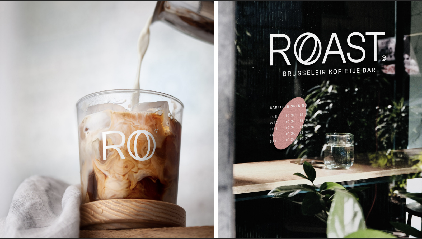
ROAST
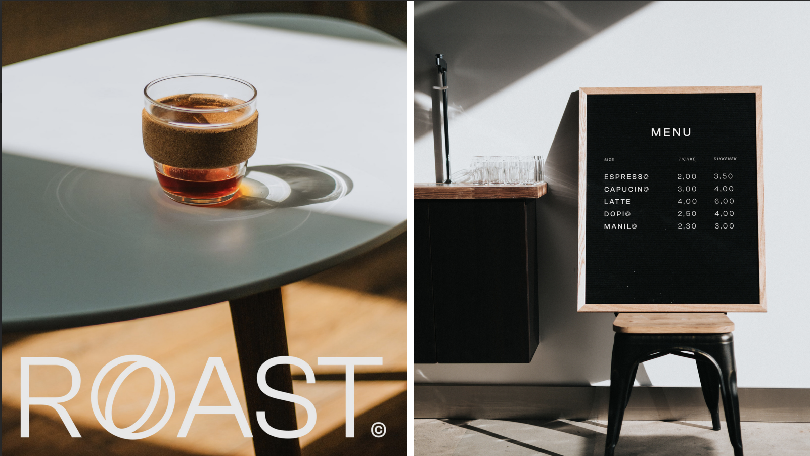
A coffee bar with a heart of its own. Located in the centre of the capital (Brussels) and surrounded by galleries and museums, the place welcomes not only coffee lovers but also the culturally curious. The establishment is characterised by its minimalist and uncluttered setting and is influenced by its own name: the lightness and derision of the Brussels character.
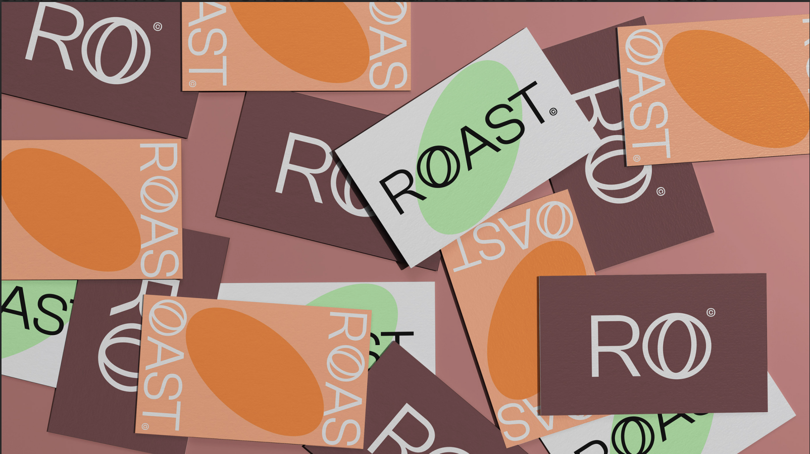
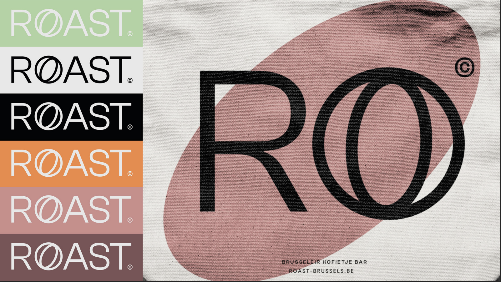
The Logo
It is a modern mix of a linear typeface and an outline "O". This subtle mix refers to the seeds brewed in the large vats of roasters allowing the logo to exist in both print and digital media.The visual identity is based on the same concept, reinforcing the interpretation of the "Roast" in all its stages and the colours of the seeds during the brewing process.
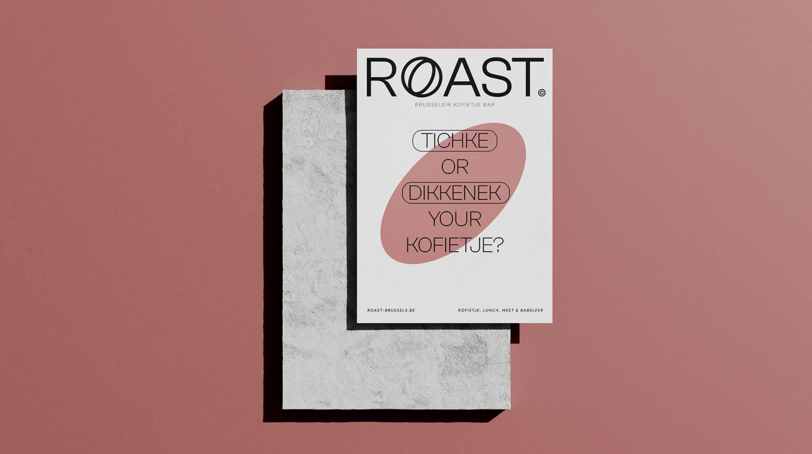
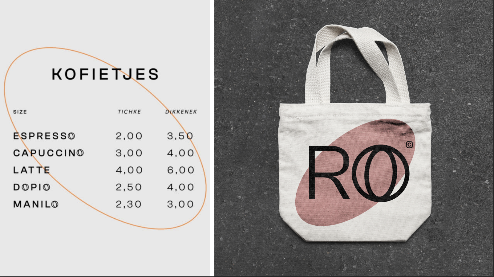
The Concept
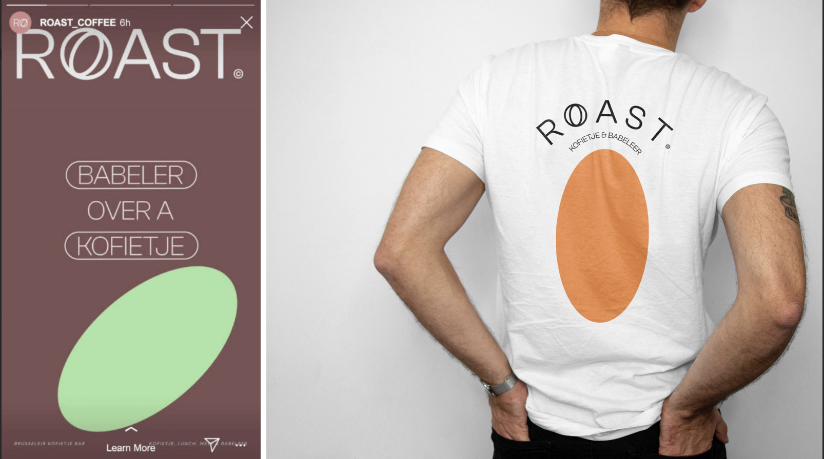
The concept and tone of communication, based on the humour and derision of the Brusseleer, takes up his expressions for general use in the café in a sometimes absurd way, just like his character (map, size of the cafés,